Blogs - Grid
Component #1
Read our latest news
We've helped some great companies brand, design and get to market.


Want to read more? Go here
                      <!-- Articles Section -->
                      <div class="container space-2">
                        <!-- Title -->
                        <div class="w-md-80 w-lg-50 text-center mx-md-auto mb-5 mb-md-9">
                          <h2 class="h1">Read our latest news</h2>
                          <p>We've helped some great companies brand, design and get to market.</p>
                        </div>
                        <!-- End Title -->

                        <div class="row mx-n2 mb-5 mb-md-9">
                          <div class="col-sm-6 col-lg-3 px-2 mb-3 mb-lg-0">
                            <!-- Card -->
                            <a class="card h-100 transition-3d-hover" href="#">
                              <img class="card-img-top" src="../assets/img/500x280/img9.jpg" alt="Image Description">
                              <div class="card-body">
                                <span class="d-block small font-weight-bold text-cap mb-2">Product</span>
                                <h5 class="mb-0">Better is when everything works together</h5>
                              </div>
                            </a>
                            <!-- End Card -->
                          </div>

                          <div class="col-sm-6 col-lg-3 px-2 mb-3 mb-lg-0">
                            <!-- Card -->
                            <a class="card h-100 transition-3d-hover" href="#">
                              <img class="card-img-top" src="../assets/img/500x280/img10.jpg" alt="Image Description">
                              <div class="card-body">
                                <span class="d-block small font-weight-bold text-cap mb-2">Business</span>
                                <h5 class="mb-0">What CFR really is about</h5>
                              </div>
                            </a>
                            <!-- End Card -->
                          </div>

                          <div class="col-sm-6 col-lg-3 px-2 mb-3 mb-sm-0">
                            <!-- Card -->
                            <a class="card h-100 transition-3d-hover" href="#">
                              <img class="card-img-top" src="../assets/img/500x280/img11.jpg" alt="Image Description">
                              <div class="card-body">
                                <span class="d-block small font-weight-bold text-cap mb-2">Business</span>
                                <h5 class="mb-0">Should Product Owners think like entrepreneurs?</h5>
                              </div>
                            </a>
                            <!-- End Card -->
                          </div>

                          <div class="col-sm-6 col-lg-3 px-2">
                            <!-- Card -->
                            <a class="card h-100 transition-3d-hover" href="#">
                              <img class="card-img-top" src="../assets/img/500x280/img12.jpg" alt="Image Description">
                              <div class="card-body">
                                <span class="d-block small font-weight-bold text-cap mb-2">Facilitate</span>
                                <h5 class="mb-0">Announcing Front Strategies: Ready-to-use rules</h5>
                              </div>
                            </a>
                            <!-- End Card -->
                          </div>
                        </div>

                        <!-- Info -->
                        <div class="position-relative z-index-2 text-center">
                          <div class="d-inline-block font-size-1 border bg-white text-center rounded-pill py-3 px-4">
                            Want to read more? <a class="font-weight-bold ml-3" href="#">Go here <span class="fas fa-angle-right ml-1"></span></a>
                          </div>
                        </div>
                        <!-- End Info -->
                      </div>
                      <!-- End Articles Section -->
Component #2

<!-- Blog Card Section -->
<div class="container">
<div class="w-lg-75 border-top space-2 mx-lg-auto">
<div class="mb-3 mb-sm-5">
<h3>Related stories</h3>
</div>
<div class="row">
<div class="col-md-6">
<!-- Blog Card -->
<article class="border-bottom h-100 py-5">
<div class="row justify-content-between">
<div class="col-6">
<a class="d-block small font-weight-bold text-cap mb-2" href="#">Product</a>
<h4 class="mb-0"><a class="text-inherit" href="#">Better is when everything works together</a></h4>
</div>
<div class="col-5">
<img class="img-fluid rounded-lg" src="../assets/img/500x280/img1.jpg" alt="Image Description">
</div>
</div>
</article>
<!-- End Blog Card -->
</div>
<div class="col-md-6">
<!-- Blog Card -->
<article class="border-bottom h-100 py-5">
<div class="row justify-content-between">
<div class="col-6">
<a class="d-block small font-weight-bold text-cap mb-2" href="#">Tech</a>
<h4 class="mb-0"><a class="text-inherit" href="#">Should You Buy An Apple Pencil?</a></h4>
</div>
<div class="col-5">
<img class="img-fluid rounded-lg" src="../assets/img/500x280/img3.jpg" alt="Image Description">
</div>
</div>
</article>
<!-- End Blog Card -->
</div>
<div class="col-md-6">
<!-- Blog Card -->
<article class="border-bottom h-100 py-5">
<div class="row justify-content-between">
<div class="col-6">
<a class="d-block small font-weight-bold text-cap mb-2" href="#">Product</a>
<h4 class="mb-0"><a class="text-inherit" href="#">This Watch gym partnerships give you perks for working out</a></h4>
</div>
<div class="col-5">
<img class="img-fluid rounded-lg" src="../assets/img/500x280/img5.jpg" alt="Image Description">
</div>
</div>
</article>
<!-- End Blog Card -->
</div>
<div class="col-md-6">
<!-- Blog Card -->
<article class="border-bottom h-100 py-5">
<div class="row justify-content-between">
<div class="col-6">
<a class="d-block small font-weight-bold text-cap mb-2" href="#">Tech</a>
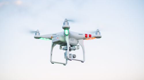
<h4 class="mb-0"><a class="text-inherit" href="#">Drone Company PrecisionHawk Names New CEO</a></h4>
</div>
<div class="col-5">
<img class="img-fluid rounded-lg" src="../assets/img/500x280/img7.jpg" alt="Image Description">
</div>
</div>
</article>
<!-- End Blog Card -->
</div>
</div>
</div>
</div>
<!-- End Blog Card Section -->
Component #3
Latest news
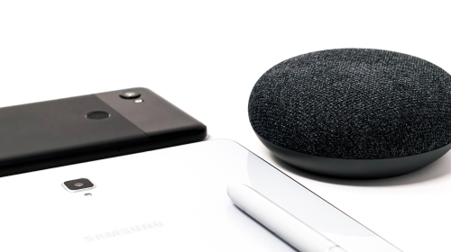
Better is when everything works together
Learn how your Google devices can do more.
July 15
Featured
Announcing Front Tutorials: Master Adobe Ai - Part II
A new tutorial to make it easier to master Adobe Ai.
July 15
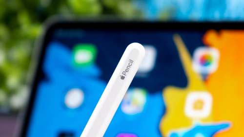
Should You Buy An Apple Pencil?
The Apple Pencil is an expensive device that comes with some interesting features, but not everyone needs them.
July 15
                      <!-- Blogs Section -->
                      <div class="container">
                        <!-- Title -->
                        <div class="row mb-5">
                          <div class="col-6">
                            <h2 class="h3 mb-0">Latest news</h2>
                          </div>
                          <div class="col-6 text-right">
                            <a class="font-weight-bold" href="#">View all <i class="fas fa-angle-right fa-sm ml-1"></i></a>
                          </div>
                        </div>
                        <!-- End Title -->

                        <div class="row mb-3">
                          <div class="col-sm-6 col-lg-4 mb-3 mb-sm-8">
                            <!-- Blog Card -->
                            <article class="card h-100">
                              <div class="card-img-top position-relative">
                                <img class="card-img-top" src="../assets/img/500x280/img1.jpg" alt="Image Description">
                                <figure class="ie-curved-y position-absolute right-0 bottom-0 left-0 mb-n1">
                                  <svg xmlns="http://www.w3.org/2000/svg" x="0px" y="0px" viewBox="0 0 1920 100.1">
                                    <path fill="#fff" d="M0,0c0,0,934.4,93.4,1920,0v100.1H0L0,0z"/>
                                  </svg>
                                </figure>
                              </div>

                              <div class="card-body">
                                <h3><a class="text-inherit" href="#">Better is when everything works together</a></h3>
                                <p>Learn how your Google devices can do more.</p>
                              </div>

                              <div class="card-footer border-0 pt-0">
                                <div class="media align-items-center">
                                  <div class="avatar-group">
                                    <a class="avatar avatar-xs avatar-circle" href="#" data-toggle="tooltip" data-placement="top" title="Nataly Gaga">
                                      <img class="avatar-img" src="../assets/img/100x100/img1.jpg" alt="Image Description">
                                    </a>
                                    <a class="avatar avatar-xs avatar-circle" href="#" data-toggle="tooltip" data-placement="top" title="Emily Milda">
                                      <img class="avatar-img" src="../assets/img/100x100/img2.jpg" alt="Image Description">
                                    </a>
                                  </div>
                                  <div class="media-body d-flex justify-content-end text-muted font-size-1 ml-2">
                                    July 15
                                  </div>
                                </div>
                              </div>
                            </article>
                            <!-- End Blog Card -->
                          </div>

                          <div class="col-sm-6 col-lg-4 mb-3 mb-sm-8">
                            <!-- Blog Card -->
                            <article class="card bg-dark text-white h-100">
                              <div class="card-body p-4 p-lg-5">
                                <span class="badge badge-primary py-2 px-3 mb-5">Featured</span>
                                <h3 class="h2"><a class="text-white" href="#">Announcing Front Tutorials: Master Adobe Ai - Part II</a></h3>
                                <p>A new tutorial to make it easier to master Adobe Ai.</p>
                              </div>
                              <div class="card-footer bg-dark border-0 pt-0 px-5 pb-5">
                                <div class="media align-items-center">
                                  <div class="avatar-group">
                                    <a class="avatar avatar-xs avatar-circle" href="#" data-toggle="tooltip" data-placement="top" title="Aaron Larsson">
                                      <img class="avatar-img" src="../assets/img/100x100/img3.jpg" alt="Image Description">
                                    </a>
                                  </div>
                                  <div class="media-body d-flex justify-content-end text-white-70 font-size-1 ml-2">
                                    July 15
                                  </div>
                                </div>
                              </div>
                            </article>
                            <!-- End Blog Card -->
                          </div>

                          <div class="col-sm-6 col-lg-4 mb-3 mb-sm-8">
                            <!-- Blog Card -->
                            <article class="card h-100">
                              <div class="card-img-top position-relative">
                                <img class="card-img-top" src="../assets/img/500x280/img3.jpg" alt="Image Description">
                                <figure class="ie-curved-y position-absolute right-0 bottom-0 left-0 mb-n1">
                                  <svg xmlns="http://www.w3.org/2000/svg" x="0px" y="0px" viewBox="0 0 1920 100.1">
                                    <path fill="#fff" d="M0,0c0,0,934.4,93.4,1920,0v100.1H0L0,0z"/>
                                  </svg>
                                </figure>
                              </div>

                              <div class="card-body">
                                <h3><a class="text-inherit" href="#">Should You Buy An Apple Pencil?</a></h3>
                                <p>The Apple Pencil is an expensive device that comes with some interesting features, but not everyone needs them.</p>
                              </div>

                              <div class="card-footer border-0 pt-0">
                                <div class="media align-items-center">
                                  <div class="avatar-group">
                                    <a class="avatar avatar-xs avatar-circle" href="#" data-toggle="tooltip" data-placement="top" title="Hanna Wolfe">
                                      <img class="avatar-img" src="../assets/img/100x100/img11.jpg" alt="Image Description">
                                    </a>
                                    <a class="avatar avatar-xs avatar-circle" href="#" data-toggle="tooltip" data-placement="top" title="John O'nolan">
                                      <img class="avatar-img" src="../assets/img/100x100/img4.jpg" alt="Image Description">
                                    </a>
                                  </div>
                                  <div class="media-body d-flex justify-content-end text-muted font-size-1 ml-2">
                                    July 15
                                  </div>
                                </div>
                              </div>
                            </article>
                            <!-- End Blog Card -->
                          </div>
                        </div>
                      </div>
                      <!-- End Blogs Section -->
Component #4
                      <!-- Blogs -->
                      <div class="container">
                        <div class="row">
                          <div class="order-lg-1 col-sm-6 col-lg-4 mb-3 mb-sm-7">
                            <!-- Blog -->
                            <article class="card align-items-start flex-wrap flex-row h-380rem gradient-y-overlay-sm-gray-900 bg-img-hero rounded-pseudo transition-3d-hover" style="background-image: url(../assets/img/400x500/img9.jpg);">
                              <div class="card-header border-0 bg-transparent w-100">
                                <a class="small text-white font-weight-bold text-cap mr-2" href="#">Creative</a>
                              </div>

                              <div class="card-footer border-0 bg-transparent mt-auto">
                                <a href="#">
                                  <h3 class="text-white">This Watch gym partnerships give you perks for working out</h3>
                                  <span class="text-white-70">Read more <i class="fas fa-angle-right fa-sm ml-1"></i></span>
                                </a>
                              </div>
                            </article>
                            <!-- End Blog -->
                          </div>

                          <div class="order-lg-2 col-sm-6 col-lg-4 mb-3 mb-sm-7">
                            <!-- Blog -->
                            <article class="card align-items-start flex-wrap flex-row h-380rem bg-dark transition-3d-hover" style="background-image: url(../assets/svg/components/abstract-shapes-20.svg);">
                              <div class="card-header border-0 bg-transparent w-100">
                                <a class="small text-white font-weight-bold text-cap mr-2" href="#">Business</a>
                              </div>

                              <div class="card-footer border-0 bg-transparent mt-auto">
                                <a href="#">
                                  <h3 class="text-white">Announcing Front Strategies: Ready-to-use rules</h3>
                                  <span class="text-white-70">Read more <i class="fas fa-angle-right fa-sm ml-1"></i></span>
                                </a>
                              </div>
                            </article>
                            <!-- End Blog -->
                          </div>

                          <div class="order-lg-3 col-sm-6 col-lg-4 mb-3 mb-sm-7">
                            <!-- Blog -->
                            <article class="card align-items-start flex-wrap flex-row h-380rem gradient-y-overlay-sm-gray-900 bg-img-hero rounded-pseudo transition-3d-hover" style="background-image: url(../assets/img/400x500/img2.jpg);">
                              <div class="card-header border-0 bg-transparent w-100">
                                <a class="small text-white font-weight-bold text-cap mr-2" href="#">Creative,</a>
                                <a class="small text-white font-weight-bold text-cap mr-2" href="#">Stories</a>
                              </div>

                              <div class="card-footer border-0 bg-transparent mt-auto">
                                <a href="#">
                                  <h3 class="text-white">Drone Company PrecisionHawk Names New CEO</h3>
                                  <span class="text-white-70">Read more <i class="fas fa-angle-right fa-sm ml-1"></i></span>
                                </a>
                              </div>
                            </article>
                            <!-- End Blog -->
                          </div>
                        </div>
                      </div>
                      <!-- End Blogs -->
Component #5
                      <!-- Blogs Section -->
                      <div class="container">
                        <div class="row justify-content-center">
                          <div class="col-lg-8">
                            <!-- Blog -->
                            <article>
                              <a class="card align-items-start flex-wrap flex-row h-380rem gradient-x-overlay-sm-dark bg-img-hero rounded-pseudo transition-3d-hover" href="#" style="background-image: url(../assets/img/900x450/img1.jpg);">
                                <div class="card-header border-0 bg-transparent w-100">
                                  <div class="media align-items-center">
                                    <span class="avatar avatar-sm avatar-circle mr-3">
                                      <img class="avatar-img" src="../assets/img/100x100/img3.jpg" alt="Image Description">
                                    </span>
                                    <div class="media-body">
                                      <span class="d-inline-block text-white font-weight-bold">Aaron Larsson</span>
                                      <small class="d-block text-white-70">Jan 09, 2020</small>
                                    </div>
                                  </div>
                                </div>

                                <div class="card-footer border-0 bg-transparent mt-auto">
                                  <h3 class="h2 text-white">Facebook is creating a news section in Watch to feature breaking news</h3>
                                  <p class="text-white-70 mb-0">Facebook launched the Watch platform in August</p>
                                </div>
                              </a>
                            </article>
                            <!-- End Blog -->
                          </div>
                        </div>
                      </div>
                      <!-- End Blogs Section -->
Component #6
Business

Should Product Owners think like entrepreneurs?
Front is a financial technology company. We build products. We do it fast and we do it well.
July 15
                      <!-- Blog Listing Section -->
                      <div class="container">
                        <div class="row justify-content-center">
                          <div class="col-md-6">
                            <!-- End Blog Card -->
                            <article class="card mb-3 mb-sm-5">
                              <img class="card-img-top" src="../assets/img/900x450/img2.jpg" alt="Image Description">

                              <div class="card-body">
                                <a class="d-block small font-weight-bold text-cap mb-2" href="#">Business</a>

                                <h2 class="h3"><a class="text-inherit" href="#">Should Product Owners think like entrepreneurs?</a></h2>

                                <p>Front is a financial technology company. We build products. We do it fast and we do it well.</p>

                                <div class="media align-items-center pt-5">
                                  <div class="avatar-group">
                                    <div class="avatar avatar-xs avatar-circle" data-toggle="tooltip" data-placement="top" title="Hanna Wolfe">
                                      <img class="avatar-img" src="../assets/img/100x100/img20.jpg" alt="Image Description">
                                    </div>
                                  </div>
                                  <div class="media-body d-flex justify-content-end text-muted font-size-1 ml-2">
                                    July 15
                                  </div>
                                </div>
                              </div>
                            </article>
                            <!-- End Blog Card -->
                          </div>
                        </div>
                      </div>
                      <!-- End Blog Listing Section -->
Component #7

Award winning guides and resources
Explore and learn more about everything from machine learning and global payments to building marketplaces and scaling your team.


                      <!-- Features Section -->
                      <div class="overflow-hidden">
                        <div class="container space-2">
                          <div class="row justify-content-lg-between">
                            <div class="col-lg-5 mb-9 mb-lg-0">
                              <div class="max-w-19rem mb-4">
                                <img class="img-fluid" src="../assets/svg/illustrations/app-wreath.svg" alt="SVG">
                              </div>

                              <div class="mb-5">
                              <h2>Award winning guides and resources</h2>
                                <p>Explore and learn more about everything from machine learning and global payments to building marketplaces and scaling your team.</p>
                              </div>

                              <a class="btn btn-primary transition-3d-hover px-4" href="#">View all Guides</a>
                            </div>

                            <div class="col-lg-6">
                              <div class="row">
                                <div class="col-sm-6 mb-5 mb-sm-0">
                                  <!-- Article Item -->
                                  <a class="d-block" href="#">
                                    <img class="img-fluid w-100 rounded" src="../assets/img/400x500/img26.jpg" alt="Image Description">
                                    <div class="shadow-none py-4">
                                      <h4>Adobe Ai</h4>
                                      <p class="text-body">Access to the Adobe Illustrator techniques</p>
                                      <span class="font-size-1 font-weight-bold">Learn More <i class="fas fa-angle-right fa-sm ml-1"></i></span>
                                    </div>
                                  </a>
                                  <!-- End Article Item -->
                                </div>

                                <div class="col-sm-6">
                                  <!-- Article Item -->
                                  <a class="d-block" href="#">
                                    <img class="img-fluid w-100 rounded" src="../assets/img/400x500/img25.jpg" alt="Image Description">
                                    <div class="shadow-none py-4">
                                      <h4>Canva Schedule</h4>
                                      <p class="text-body">Create and schedule amazing social content</p>
                                      <span class="font-size-1 font-weight-bold">Learn More <i class="fas fa-angle-right fa-sm ml-1"></i></span>
                                    </div>
                                  </a>
                                  <!-- End Article Item -->
                                </div>
                              </div>
                            </div>
                          </div>
                        </div>
                      </div>
                      <!-- End Features Section -->
Component #8
Front services
Improve & boost your services with Front that provides all kinds of services and will help your audience grow through all platforms.


                      <!-- Services Section -->
                      <div class="container space-2">
                        <!-- Title -->
                        <div class="w-lg-60 mb-5 mb-sm-11">
                          <span class="d-block small font-weight-bold text-cap mb-2">Front services</span>
                          <h2 class="text-lh-lg">Improve & boost your services with Front that provides all kinds of services and will help your audience grow through all platforms.</h2>
                        </div>
                        <!-- End Title -->

                        <div class="row">
                          <div class="col-lg-5 mb-3 mb-sm-5 mb-lg-0">
                            <!-- Card -->
                            <a class="card bg-primary text-white min-h-380rem h-100 transition-3d-hover" href="#">
                              <figure class="position-sm-absolute top-0 left-0 w-100">
                                <img class="img-fluid rounded-top" src="../assets/svg/components/abstract-shapes-8.svg" alt="SVG">
                              </figure>

                              <article class="d-flex align-content-end flex-wrap h-100 p-4">
                                <h3 class="text-white">Have a meaningful impact</h3>
                                <p class="text-white-70">We are aggressive about giving opportunities to Fronts who have proven to be good at executing on them, regardless of where they are in their career.</p>
                                <span class="text-white font-weight-bold">Learn More <i class="fas fa-angle-right fa-sm ml-1"></i></span>
                              </article>
                            </a>
                            <!-- End Card -->
                          </div>

                          <div class="col-sm-6 col-lg mb-3 mb-sm-0">
                            <!-- Card -->
                            <a class="card min-h-380rem h-100 transition-3d-hover" href="#">
                              <figure class="position-sm-absolute top-0 left-0 w-100">
                                <img class="img-fluid rounded-top" src="../assets/svg/components/abstract-shapes-7.svg" alt="SVG">
                              </figure>

                              <article class="d-flex align-content-end flex-wrap h-100 p-4">
                                <h3>Documentation</h3>
                                <p class="text-body">Whether you're a startup or a global enterprise, learn how to integrate with Front.</p>
                                <span class="text-primary font-weight-bold">Learn More <i class="fas fa-angle-right fa-sm ml-1"></i></span>
                              </article>
                            </a>
                            <!-- End Card -->
                          </div>

                          <div class="col-sm-6 col-lg">
                            <!-- Card -->
                            <a class="card min-h-380rem h-100 transition-3d-hover" href="#">
                              <figure class="position-sm-absolute top-0 left-0 w-100">
                                <img class="img-fluid rounded-top" src="../assets/svg/components/abstract-shapes-6.svg" alt="SVG">
                              </figure>

                              <article class="d-flex align-content-end flex-wrap h-100 p-4">
                                <h3>Explore the Snippets tools</h3>
                                <p class="text-body">Quickly Front sample components, copy-paste codes.</p>
                                <span class="text-primary font-weight-bold">Learn More <i class="fas fa-angle-right fa-sm ml-1"></i></span>
                              </article>
                            </a>
                            <!-- End Card -->
                          </div>
                        </div>
                      </div>
                      <!-- End Services Section -->